The Mortality Chart That Wouldn't Let Go

An Observation on Disinformation Mechanics
Or: How I stumbled into Finland’s alternative media ecosystem and learned to read statistical sleight-of-hand
I. The Rabbit Hole Opens
It started with a Facebook post: a dramatic chart of Finland’s “cumulative excess deaths” rising from 2021 onward. The caption read: Finland’s excess mortality continues at alarming levels—so attention inevitably turns to vaccines.
The link led to Markanmedia.fi, a Finnish alternative outlet, which framed the post-2021 rise as too obvious to ignore and treated alternative explanations as evasions. The comments section went further: anecdotes of personality changes, anonymous clinical authority, and a request for readers to share vaccine-harm stories.
Something felt off—not just incorrect, but constructed to feel inevitable.
So I did the boring thing: I checked what the chart was actually measuring.
II. The Specimen: Mortality Watch and the Cumulative Trick
The chart came from Mortality Watch, a data aggregation site that visualizes excess mortality across countries. It offers multiple ways to view the same underlying data.
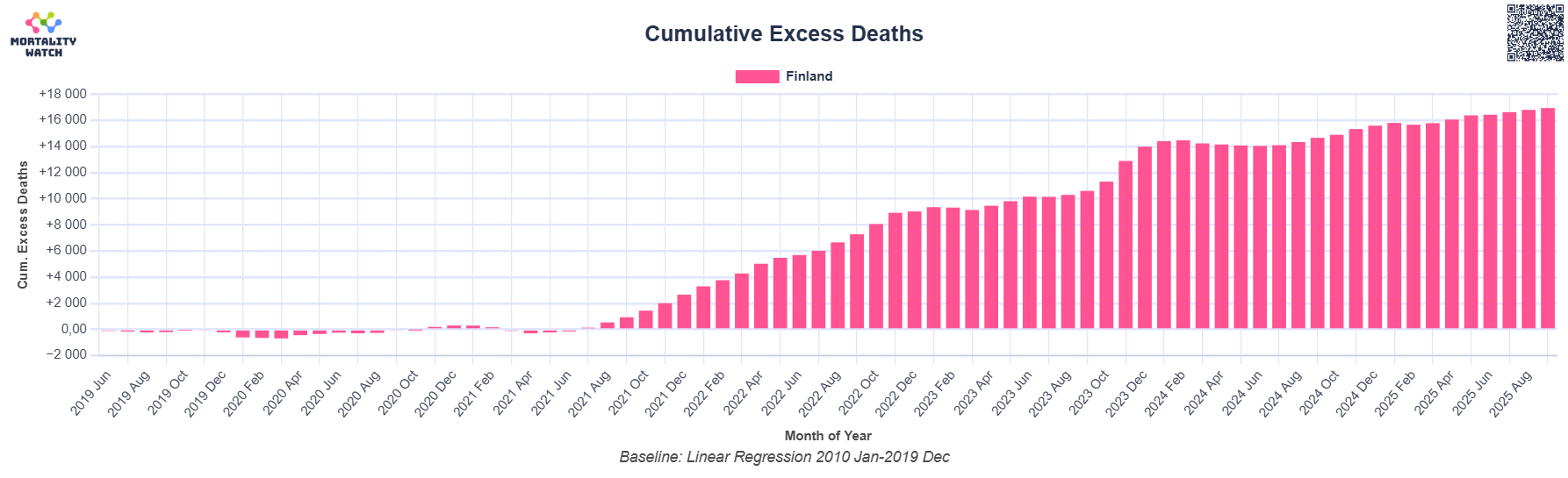
The specific view referenced used these settings:
- Country: Finland
- Baseline: Linear regression, 2010–2019
- Display: Cumulative excess deaths
- Age: All ages combined
Here’s what that chart actually represents:
“Cumulative excess deaths” is a running sum of (observed deaths minus model-predicted deaths).
It is not “deaths caused by X.”
Even if the excess is real, the chart alone cannot tell you what caused it. The story you see depends heavily on modeling and presentation choices.
Three choices, in particular, can dramatically change both the magnitude and the apparent narrative.
1. Baseline choice matters enormously
A linear trend fitted to 2010–2019 is a blunt counterfactual for 2020–2025. Age-structure changes, seasonal patterns, mortality displacement, and pandemic-era behavior shifts all push observed deaths away from a simple extrapolated line.
That doesn’t make the chart “fake.” It means the magnitude is sensitive to assumptions—and sensitivity is not causation.
Why this baseline is fragile:
- Population aging is not linear; mortality pressure increases as large cohorts enter higher-risk ages
- Finland’s early-pandemic period shows relatively little excess in early 2020 compared with many peers
- Small baseline shifts can translate into large cumulative differences over multiple years
Different reasonable baselines produce different excess-death totals. If that sensitivity isn’t shown, a single headline number can mislead.
2. Cumulative display hides timing
Cumulative displays are good for accounting (“how much above or below the model so far”) but poor for diagnosis (“what changed when”).
Causation lives in timing; cumulative charts blur timing.
Once the bars start rising, they almost never come back down unless deaths remain below expected for long periods. The visual impression is of a crisis that only worsens, even if the monthly excess peaked earlier and later declined.
If you want to test the claim “something began in 2021,” you need the weekly or monthly series, not the running total.
A useful sanity check is to translate the cumulative total back into annual scale. Finland normally sees on the order of ~55,000 deaths per year. A cumulative excess of ~17,000 spread across several years is not a ghost-town event; it’s a “some years were meaningfully worse than expected” event, concentrated in particular seasons and (as age-stratified analyses show) largely in older age groups.
That distinction matters. The chart’s emotional punch comes from a large number paired with a monotonic visual. The diagnostic questions are: when did the excess occur, and in whom?
3. All-ages aggregation conceals the decisive question
Where are the deaths actually occurring?
- In people aged 85+? (consistent with aging and respiratory disease)
- In people aged 25–64? (would require a very different explanation)
The chart doesn’t say. That omission is what makes the misleading inference possible.
III. The Ground Truth: What the Peer-Reviewed Evidence Shows
The counter-evidence comes from a Nature Communications study by the European Mortality Monitoring Network (EuroMOMO), analyzing 26 European countries (including Finland) from 2020 to mid-2023 using age-stratified, seasonally adjusted baselines.¹
Timing contradicts vaccine causation
The study finds that the largest pooled European excess mortality occurred in the first wave of the pandemic (early 2020)—before vaccines were available. It states explicitly:
*“The excess mortality seen in the first wave can largely be attributed to the effect of COVID-19 alone.”*¹
Later waves show lower excess, comparable to severe influenza seasons. This decline occurred as population immunity and vaccination coverage increased.
That timing matters. It anchors the existence of large excess mortality in a pre-vaccine period.
Age distribution contradicts the working-age harm narrative
The paper is unambiguous about age patterns:
*“Excess mortality was primarily observed in individuals aged 65 years and above, with the highest estimated excess mortality in elderly aged 85 years and above.”*¹
For younger populations:
*“No or only modest excess mortality was detected in children and younger adults below 45 years of age.”*¹
Age-stratified results vary by country and week, but the EuroMOMO analysis consistently shows a steep age gradient. Illustratively:
| Age group | Pattern | Typical contribution |
|---|---|---|
| 85+ | Substantial excess, mainly early waves | Largest share |
| 75–84 | Moderate excess | Significant |
| 65–74 | Modest excess | Some |
| 45–64 | Small excess | Minimal |
| <45 | “No or only modest” | Negligible |
(Illustrative of the qualitative pattern described in the paper; see the original study for country-specific breakdowns.)
This matters because an all-ages cumulative chart can be narrated as “working-age catastrophe” even when the dominant contribution is among the elderly—exactly what a respiratory pandemic predicts.
Finland’s specific pattern
Finland shows relatively little excess early in 2020, followed by larger excess later, including in 2022. That timing aligns with later variant waves, the return of influenza and RSV as restrictions eased, healthcare strain, and demographic aging.
A vaccine-primary explanation must account for why:
- The largest pooled excess occurred pre-vaccine
- The burden is concentrated in older age groups
- Later-wave excess trends downward as immunity and vaccination rise
2024 update contradicts an ongoing crisis narrative
According to Statistics Finland, deaths declined clearly in 2024 compared with 2023, life expectancy reached record highs, and overall mortality was lower than pre-pandemic levels.²
If vaccines were the dominant driver of ongoing excess mortality at population level, you would expect deaths to remain elevated or worsen. Instead, they are declining.
IV. Vector 0: Why This Disinformation Has Fuel
Before mapping how the narrative spreads, it’s important to acknowledge why it has traction.
Excess all-cause mortality is real—and genuinely complex.
It is a composite outcome influenced by:
- COVID-19 variant waves
- Return of other respiratory pathogens
- Temperature extremes
- Healthcare system disruption
- Behavioral changes
- Demographic aging
The disinformation advantage looks like this:
Real composite outcome
+ Causal uncertainty
+ Fear and urgency
= Perfect medium for insinuation
You can’t dismiss the concern as “made up.” But you can exploit the ambiguity to insert a preferred explanation without having to prove it.
This is the essential fuel. Everything else is distribution machinery.
V. The Distribution Machinery
Vector 1: Model Choice + Rhetorical Framing
The mechanism is simple: select visualization settings that produce dramatic results, then present the selection as “the data.”
Mortality Watch offers multiple baselines and displays. A user can:
- Choose a long baseline (2010–2019)
- Use a cumulative view
- Aggregate all ages
and then present the result as definitive, without showing how sensitive it is to reasonable alternatives.
The rhetorical leap is from “this model shows X” to “X deaths were caused by [implied factor].”
The problem isn’t the tool. It’s the selective presentation paired with causal insinuation.
Vector 2: Cultural Localization
The structure of the narrative is similar across countries, but the cultural on-ramp differs.
In Finland, the framing is not “tyranny,” but silence.
- “Why won’t they talk about this?”
- “What are they hiding?”
- “Are we too polite to ask?”
High-trust societies produce sharper betrayal gradients. This framing recruits conscientious, educated people who don’t see themselves as conspiracy-minded at all—only as citizens asking reasonable questions.
Vector 3: Echo Chamber Injection
The Facebook thread shows the pattern:
- Seed claim (chart + article)
- Request validation (“share your experiences”)
- Confirmation cascade (anecdotes, anonymous authority)
- Dissent attacked
- Community self-seals
Contradictory evidence becomes proof of the cover-up.
Vector 4: Algorithm Amplification
Platforms reward engagement and emotional arousal.
Nuanced explanations underperform. Alarmist framing spreads.
This isn’t about ideology—it’s about incentives.
Vector 5: The Methodology Obscurity Shield
The asymmetry is stark:
- Easy claim: “Look, the bars go up.”
- Hard correction: “Those bars are model residuals sensitive to assumptions.”
Most people can’t evaluate model sensitivity, so complexity itself becomes a shield. Anyone pointing it out is accused of deflection or denial.
Vector 6: Age-Band Laundering
Show all-ages cumulative excess, then talk as if it reflects working-age harm.
Skip age stratification, and the decisive verification step disappears.
Vector 7: Ledgerization
Cumulative charts turn epidemiology into moral accounting.
Periodic variation becomes a monotonic ledger of wrongs. Language of blame and “accountability” attaches naturally.
Vector 8: The Expertise Paradox
Any expertise that contradicts the narrative is treated as evidence for the narrative. Agreement among independent experts becomes proof of capture.
The belief system becomes unfalsifiable.
VI. The Break-the-Spell Protocol
You don’t need a statistics degree. You need three questions:
A. Show me the non-cumulative series.
Does the timing match the claimed cause?
B. Show me the age bands.
Where is the excess actually occurring?
C. Show me baseline sensitivity.
Does the magnitude hold under reasonable alternative assumptions?
If someone can’t provide A or B, treat the causal claim as unproven.
If they refuse C, treat the magnitude as unstable.
You don’t have to argue. You can simply say:
“I’m not confident enough to attribute cause from that chart alone.”
VII. What Would Change My Mind
I would take vaccine causation seriously if:
- Excess concentrated in working-age populations with timing matching rollout
- Cross-national replication held after controlling for demographics and COVID burden
- A plausible biological mechanism with dose-response existed
- Alternative explanations were ruled out
- Negative controls failed to falsify the effect
Current evidence meets none of these conditions.
VIII. What’s Actually Happening
The best-supported synthesis is mundane, not sinister:
- Early waves caused the largest excess
- Later waves were smaller and age-graded
- Other pathogens returned
- Healthcare disruption mattered
- Demographics continue to shift
Finland’s later bump is not unique. Several countries saw later-wave burden shifts as controls relaxed and immunity patterns evolved.
IX. Why This Pattern Persists (A Systems View)
At this point, it’s tempting to explain what’s happened here in terms of misinformation, bad actors, or statistical illiteracy. Those factors exist—but they’re not sufficient. They don’t explain why this pattern is so stable, why it recurs across countries and topics, or why it feels emotionally convincing even to educated, well-intentioned people.
For that, we need a systems view.
Cybernetician Stafford Beer offered a deceptively simple principle known as POSIWID: the purpose of a system is what it does. Not what it claims to do, not what we hope it does—but what it reliably produces under real conditions.
Applied here, POSIWID shifts the question from “Why are people misled?” to “What is this information ecosystem actually optimized for?”
What the system claims to do
- Inform the public
- Clarify uncertainty
- Explain complex phenomena
What it actually does
- Produces narratives that feel causally complete
- Rewards emotionally legible explanations
- Converts ambiguity into shareable certainty
By POSIWID’s definition, the purpose of the contemporary information ecosystem is not accuracy under uncertainty. It is meaning-production under attention constraints.
The Mortality Watch → Markanmedia → Facebook loop does not “fail” at truth-seeking. It succeeds at its real function: making uncertainty tolerable and socially navigable.
The Chart as a Cybernetic Stabilizer
From a systems perspective, the cumulative mortality chart is not primarily a measurement instrument. It is a control artifact.
What it reliably does:
- Reduces high-dimensional reality (age, time, seasonality, demographics) into a single scalar
- Converts oscillatory signals (pandemic waves) into a monotonic trend
- Produces a stable emotional output: “something is consistently wrong”
This is classic variety reduction—a central concept in cybernetics. Complex environments overwhelm human cognition. Stable systems survive by compressing that complexity into manageable forms.
The chart succeeds because it makes complexity metabolically cheap.
Human cognition cannot comfortably hold:
“40% aging, 30% Omicron, 15% healthcare delays, 10% flu return, 5% behavioral change.”
But it can hold:
“17,000 excess deaths since vaccines.”
Under POSIWID, the chart’s purpose is not to diagnose causation—it is to stabilize a belief state under uncertainty.
The Facebook Thread as a Self-Sealing Loop
The comment thread is often described as “discussion,” but its behavior reveals something else.
It functions as a positive feedback system with no effective negative feedback channels.
Inputs:
- Authority signal (the chart)
- Epistemic ambiguity
- Pandemic-era social anxiety
Amplifiers:
- Anecdotes (“I’ve seen personality changes”)
- Anonymous authority (“a doctor told me”)
- Moral language (“cowardice,” “silence,” “crimes”)
Rejected signals:
- Methodological critique (reframed as denial)
- Expertise (reframed as capture)
- Requests for disaggregation (ignored)
By POSIWID, the purpose of the thread is not truth discovery. It is group identity reinforcement.
Signals that would test accuracy are treated as disturbances, not corrections. The system isn’t broken—it is maintaining coherence under stress.
How the System Routes Complexity
Institutions like THL, EuroMOMO, and Statistics Finland are engaged in what systems theory calls variety management:
- Age stratification
- Seasonal adjustment
- Uncertainty bounds
- Multi-causal explanation
But the public information ecosystem cannot absorb that level of complexity.
So the system reroutes it:
| From | To |
|---|---|
| Formal models | Moral narratives |
| Distributed causation | Single-agent blame |
| Institutional uncertainty | Personal certainty |
By POSIWID, the system’s purpose is to offload cognitive load from institutions onto identity-based communities.
This is not a moral failure. It is how large social systems remain metabolically efficient. Sustained nuance, ambiguity tolerance, and distributed expertise are expensive. Identity-based certainty is cheap.
Why High-Trust Societies Flip Faster
Finland’s role here is not accidental.
High-trust societies operate with:
- Low informational noise
- High trust bandwidth
- Tight coupling between institutions and public belief
When that trust is strained, the system does not degrade gradually. It bifurcates.
Instead of:
“Institutions are imperfect but informative”
The system snaps to:
“If they won’t say this, what else are they hiding?”
Under POSIWID, the system’s purpose shifts from information transmission to trust adjudication. The chart is no longer used to learn—it is used to decide whom to believe.
This is a phase transition, not a failure.
Why the A/B/C Protocol Works
The A/B/C protocol introduced earlier works because it quietly restores negative feedback without threatening identity.
- A (non-cumulative view) reintroduces oscillation
- B (age bands) reintroduces structure
- C (baseline sensitivity) reintroduces provisionality
Most interventions attack belief and trigger defensive closure. This one invites diagnosis instead.
It doesn’t say “you’re wrong.”
It says “let’s test whether this conclusion is robust.”
From a systems perspective, that’s not debate—it’s maintenance.
The Core POSIWID Insight
In plain language:
- The purpose of the chart is not to explain deaths—it is to stabilize meaning
- The purpose of the thread is not to investigate—it is to form identity
- The purpose of outrage is not accountability—it is complexity reduction
- The purpose of rejecting expertise is not ignorance—it is system closure
What you encountered wasn’t Finnish pathology or individual failure.
It was a human information system doing exactly what it evolved to do when uncertainty exceeds tolerance.
Understanding that doesn’t excuse the outcomes—but it explains why they persist, and why simple “debunking” so often fails.
X. Conclusion: It’s About Standards, Not Tribes
This isn’t about being “pro-vaccine” or “anti-conspiracy.”
It’s not about trusting or distrusting authorities.
It’s about whether a claim survives basic robustness checks.
The Mortality Watch → Markanmedia chain fails because it treats model residuals as harm, hides age structure, obscures timing, leaps from correlation to causation, and ignores better-supported explanations.
That’s not silenced truth. It’s motivated reasoning with statistical window dressing.
The good news is simple: better tools beat better slogans.
Perkele.
Acknowledgments
This analysis draws on the EuroMOMO / Nature Communications study (26 countries; 2020–mid-2023)¹ and official Finnish statistics. Where quantitative claims are made, sources are cited. Where patterns are described qualitatively, they are labeled as such. Interpretive sections reflect my analysis. All remaining errors are my own.
References
- Nørgaard SK et al. Excess mortality in Europe estimated by EuroMOMO during the COVID-19 pandemic and previous influenza seasons. Nature Communications (2025).
https://www.nature.com/articles/s41467-025-67981-1 - Statistics Finland. Life expectancy reached new record in 2024, number of deaths fell clearly. December 2024.
https://stat.fi/en/publication/cm1jb92os47x007uqh3ioetb3